Textaizer -
Help Textaizer -
Help |
1. Text mosaic
Text Mosaic: from text to
picture
Text Mosaics are pictures made from text where
the colour of each character is derived from a source picture. Any picture can be
used, and any text can be chosen. If a text is too short to cover the picture,
it will be repeated. Textaizer has several options to refine the creation of
the text mosaic, and a few basic bitmap filters to tune the (colours of the)
source picture to improve the results.
There are three control groups for text mosaic
creation: the 'Text mosaic
settings', the 'Text mosaic
options' and the 'Circle settings'.
The Text mosaic
settings
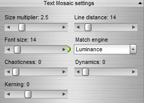
- (Bitmap) size
multiplier increases the size of the resulting bitmap. The maximum
value is 16x, the minimum 0.5x. For instance when a bitmap has 89x46
characters and is 1.5 Mb in size, a multiplier value of 2.0x will increase the
size to 178x92, and a size of 5.5Mb 9 (so: the end result becomes 4x the
size). With increasing sizes, the calculation time increases accordingly.
On slow systems, text mosaic creation may then take tens of seconds.
- Font size sets the size of the font. The font
typeface is defined in the 'Tools' tab ('Font settings'). When the font size is changed, the 'Line distance' setting follows the font size,
multiplied by 1.6 (to create sufficient visible space between lines). The
coloured 'LED' to the right of the font-size box indicates the quality of the
print when printed on A4 or letter paper. Green means that the text is well
readable, yellow is a danger zone, and red is not
recommended.
- Line
distance sets the distance between two lines of
text measured in font size points. When changing the font size, this value
follows, but it can be changed separately while keeping the font
size.
- (Size) matching
engines: there are three font size engines. Each engine has a
different way to modify/adapt the size for each character. These engines
work closely together by a colour determining method, indicated in the
control box for 'text mosaic
options'.
- 'Luminance' = the font size follows a predetermined formula to increase
(or decrease) size with increasing (or decreasing) luminance of the average
colour of that part of the picture on which the character will be
put.
- 'Dynamic' = the font changes with the available white space that this
character can possibly use, and can therefore increase with increasing
available space. The resulting text appears very dynamic, with the
smallest character size as the set font size. This way a better
coverage is achieved and the effect helps to cover 'holes' or
'spots' in the result.
- 'Fixed' = the font size does not change and is
equal for all characters of the final text mosaic.
-
'Density mask' = the font size is determined by a grey-scale
bitmap. More information is provided in the special features chapter.
- Chaoticness determines to what degree the character position is randomized (within a predefined
boundary). The character is placed very close to the intended position, and
can vary as much as its own size.
- Dynamics
determines the degree of the effect of the 'chaotic' size
engine. A high value of dynamics will try to fully use the empty
space of a character, while a low value will almost place the character as the
'fixed' size engine.
The text
mosaic options
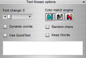
- Font change is the
probability that a font will change per word or per character. A value of
0 assures no font change whatsoever.
- When Dynamic words is checked the font will change per
word rather then per character. The default is per character.
- When Keep words is selected, all words are kept as a
whole, and not truncated at the end of a horizontal line.
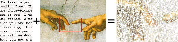
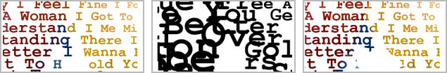
- The colour match engine determines how the colour
is derived form the picture. This control is a selector. From left to right:
colours from the source picture; black and white (emboss effect); and blend with the picture. In the last case a character may have different
colours, while with the first engine each character has only one colour depending
on the corresponding position of the source file. In the picture below
the differences are shown, e.g. look at the colour(s) of the letter 'n' (in
the word 'Woman', 2nd line, 4th word from the end).
- Random characters can be taken instead of the
provided text file. In that case the text is made from randomly selected
characters of the alphabet, added with special signs, such as ()_+*&^%
etc.
- Use Quick Text. When checked the text in
the box is used instead of the provided text in the input file. A
ticked box overrides the text file data. The limitation is 256
lines of text, and in case the number of lines exceed 256, the 'Quick Text' will automatically be unchecked to
avoid quality problems. It is advised to make longer sentences of
the input text to avoid a large number of paragraphs (or lines). The box 'Random characters' must be unchecked to have this option
working.
Using a web page content as text
source
Text
Mosaics can be
made from a pre-loaded text file, but also using an URL of a web page. To activate
that feature simply provide the URL and check the tick box. This feature
is only available for licensed users. The URL must contain valid data. If the
application doesn't find valid text (the web page source data is used) a
warning is given, and the text from the file is used (as normal text
mosaic). You'll find the URL setting in the 'Tools' section (the tab on the right
side).

Since
web pages usually contain unpredictable variations of content, there is no
practical way to find out if the page will be correctly loaded or not. In many cases
this will be trial and error. For instance:
http://www.google.com will generate an error, but
http://www.google.nl won't. Many common words are already filtered out, but
HTML, css and java script etc. is too elaborate to completely remove these
kind of words automatically, so the content can be exciting or pretty
dull, depending on the page.
Circle settings
A regular text mosaic is made from text, from left
to right. A circle text mosaic is built as one giant outward spiralling text
around the picture centre.
- Circle density sets
the amount of spirals of the picture. A low value looks like a giant spiral, a
high value may generate a very densely packed picture. So, a low value
increases the distance between the spiralled lines and may lead to loss of
picture integrity, while a high density may result in overlapping
characters.
- Kerning determines the actual distance between
characters along the spiral. A high value will create a detectable space
between adjacent characters along the spiral.
- When Don't rotate the
characters is checked, the text on the spiral is not rotated along the
spiral angle.
To activate the circular text
option, the box 'Apply circular
text' must be
checked.
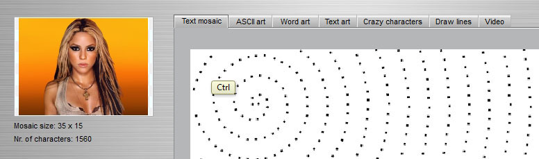
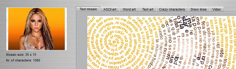
When you press the 'CTRL' key and left-click with the mouse somewhere in the picture,
the centre of the circular patter will move to that position. This new feature
(version 5.0) allows therefore to create ex centric spirals. The picture
below shows the effect of this feature.
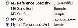
Note:
Most fonts can be rotated: True Type Fonts ( ) as well as Open Type
Fonts (
) as well as Open Type
Fonts ( ) are possible. In the picture below it can
be seen that MS Sans Serif and MS Serif can both be used for text rotation.
This feature applies to the Videaizer as
well.
) are possible. In the picture below it can
be seen that MS Sans Serif and MS Serif can both be used for text rotation.
This feature applies to the Videaizer as
well.