Calligram Creator -
Help Calligram Creator -
Help |
Calligram Creator -
Help
The graphical user interface
The
application is build in functional tabs. Some of the tabs have also tabs
('sub-tabs') in which specific functionality is managed. On top you find a
simple shortcut menu bar, with mainly ('Settings') save and reset functions. The 'Tools' menu has an 'About us', the shortcut to the Help file, and
the web-update check. 1. The Administrator tab
Here you
find all the administrator settings. These
settings are managed from sub-tabs, each with a specific purpose and
theme. These sub-tabs are:
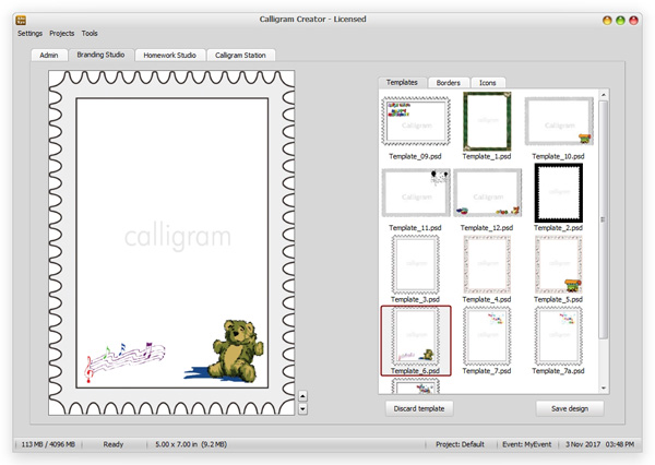
2. The Branding Studio
Here you find a quit simple
interface to make a template for the Calligram. This tab has a very basic layer
editor, where layers of artwork can be stacked, overlapping the Calligram. Next
to simple artwork pictures, you can also prepare the artwork, and save it as a
.psd (Photoshop file format) and reload it as a composite template. 3. The Homework Studio
In this tab you'll find 4
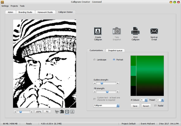
sub-tabs: 4. The Calligram Station In this fourth
and last tab you find all the application Calligram creation buttons. You have
4 buttons to create, take a snapshot, print, and e-mail the Calligram result.
This tab is probably the most used tab, since all the other tabs are typically
used to set-up your event, and then use this tab for the actual
event
work-flow.
A dedicated extra
tab is made available in the Calligram Station. In this tab several useful
event functions are put together. The controls for Calligram creation
or for Emojigram creation will appear here. This is really only used in the occasional
mismatch between the snapshot person, and the default values. Next, in case of
a Calligram output, a custom word can be selected, replacing the test file.
Also, the choice 'Calligram',
'Emojigram' or 'Legogram' can be made here.
For instance, for a Calligram, the colour pattern can be tweaked.
In the second tab a Hot folder viewer is placed. In this tab,
also the orientation can be set
on the fly: landscape or portrait. When changing the orientation, the original picture is kept,
and only cropped to match the landscape or portrait area. So, switching between
the two orientations is basically lossless. The zoombar (left below the
image) can be used to select the part of interest. This zoombar is only working
in image mode (the photo camera icon, see next paragraph). Zoom and pan now is
fully made available, so the techie is fully in charge of what part will be made
into a Calligram. Additional support of skin or face detection can speed up the
cropped area considerably.
Finally,
four buttons are added in this tab (in the screenshot above: below the
black and white Calligram source picture). With these two buttons you can toggle
between the webcam live stream (the video camera image), and the Calligram
picture (the photo camera icon), the Calligram outline (the graph icon) and the
final calligram result (the people icon). The light blue line underneath the
image indicates which viewer is made visible. The toggle action can be done
whenever an image is available. When an image in the snapshot queue is
double-clicked (= becomes active in the image viewer), then simply by selecting
the Calligram outline viewer (the graph icon), the Calligram outline is created.
The people icon (=
the Calligram) will only become active
when a Calligram has been created. The video image icon only becomes available
when a live stream webcam is active.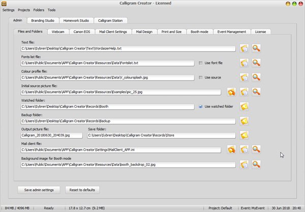
Files and folders: manage all the application's external inputs, like text, colour
and mail client settings.
Webcam: use an externally
attached or internal webcam to make the snapshots.
Mail client settings: all
the relevant mail client settings are managed here.
Mail design: the content
of the actual mail is managed from this tab. It includes a WYSIWYG
editor.
Print and Size: in this tab you
manage the printed output size settings, and also the reprints of earlier created
Calligrams.
Event management: to inspect the
progress of the Calligram creation, including error and warning messages, and
to select an event for the data logger.
License: the tab for
inspecting the license file (and how many license days you still have).Each tab can have one or two
buttons to store/save the current settings which is applicable to that
tab.
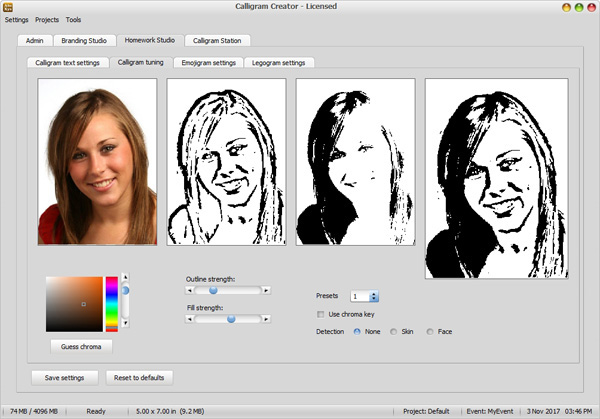
Calligram text settings: where you
can define the parameters of the Calligram text, like font, typeface, size,
colour etc.
Calligram tuning: to finetune the
black and white 'base' for the Calligram (black =
text will be placed, white =
keep white).
Emojigram settings: to finetune the settings for creating
a picture mosaic from a library of emojis
Legogram settings: to tune the settings of a 'Legogram', where the output is
a 3D-realistic brick mosaic picture of the source
snapshot.