 Calligram Creator -
Help Calligram Creator -
Help |
 Calligram Creator -
Help
Booth interface
How to use the Booth interface?
Calligram
Creator can work in
two modes: operator assisted, and unaided. The latter is typically applied in
Photo booths. The Photo booth must provide the following
requirements: The
interface is initiated from the 'Event Management'
tab, by pressing the 'Show visitor interface'
button: The
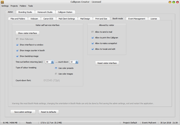
folllowing 'Visitor self-service interface' controls are
available: The
folllowing 'Allowed by visitor' controls are
available: 'Reset
visitor interface': this will reset the interface back to the default
settings. The GUI will also be hidden. Only by pressing 'Show visitor
interface' the GUI is shown again. A snapshot is made by an external
source
When a Photo
booth is used, but the snapshot is still made by a professional operator,
e.g. with a special background, greenscreen or for other reasons, the 'Hot folder' is used to show the image
in the interface of the customer. Multiple images
can exist in this Hot folder. Most important: the snapshot queue will
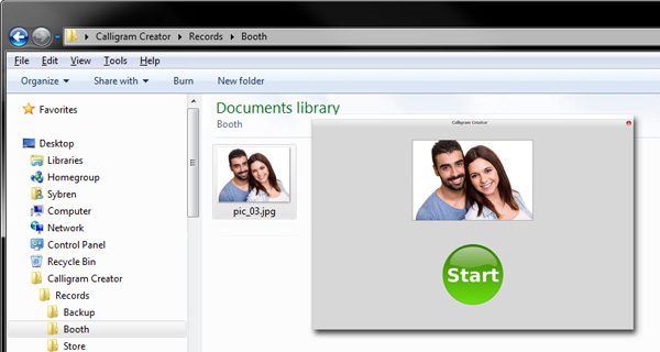
effectively process the images in order of time: first images first. The screenshot compilation
below shows what happens after an image is put in the Hot Folder (here:
'Booth'). The inset on the
right
is a resized Booth interface, where the image is now shown. After
pressing the GUI is shown, slightly smaller than the interface of the main
application. The booth window is not put on top, so when you click the main
application, it will move the booth interface to the back. This new window can
be dragged to a second output monitor is needed. Dragging the window from its
default position will reveal again the tab 'Event
Management'. When checking the option 'Show full
screen', the main application will then become hidden, but is still
visible 'below' the GUI window. Pressing the 'ESC'
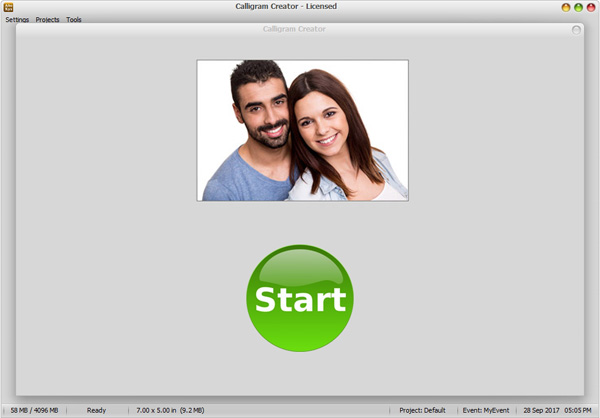
will dock the window back to the application, and the tab 'Event Management' is now fully visible again. This is the view
when maximized to full screen, and the (visitor) 'Start'
button is now visible. The customization booth interface
The current version of Calligram Creator has three different
'grams': a Calligram, and Emojigram and a Legogram. The choice is made by the
booth owner (techi, admin, whoever prepares in the interface). The visitor
cannot change the type of output. The choice is made either at the start of the
application, or using the type selector in the Calligram Station. The Calligram booth interface
After
having pressed the Start button, two scenarios can be followed: tethered
shooting will start immediately in the customization screens, while webcam
shooting will result in a video mirror,
with a countdown timer of 5 seconds. The image above
is the interface of a webcam, the image below is
the result of a tethered shooting scenario. Note: the recently added face and skin recognition
is not available in Booth mode. The snapshot is the actual cam image, not filtered or
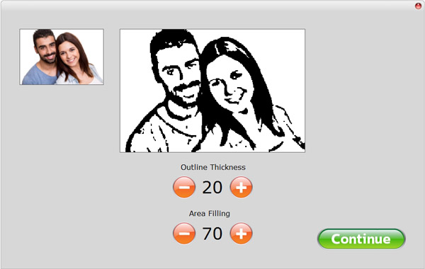
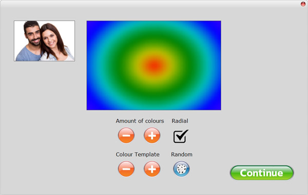
panned/zoomed in any way. Calligram creation has two customization controls,
which are offered one at the time. Emojigram and Legogram both have only one,
details are shown further
down this chapter. Here the familiar controls are
now shown again: After
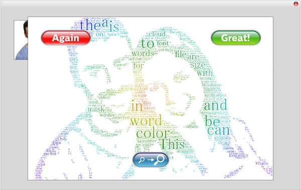
completion of the Calligram the full result is shown. The visitor can now choose
to try again, or accept the result, and start
the next actions (mail, print). The magnifying glasses represent the option to zoom in and
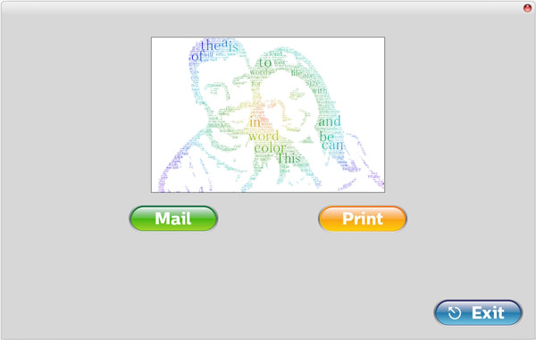
out, and move the image with the mouse/fingers over the screen: When the 'Great' button is pressed, the visitor can now complete the
session by printing and/or mailing. The post-creation options are set with the
'Allow' checkboxes in the tab 'Event Management'. In the example below both mailing and printing was
allowed. In case also the mailing was allowed,
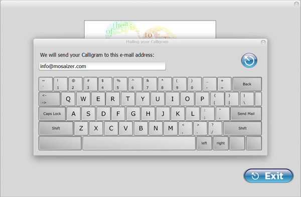
an e-mail keyboard is now shown: The
keyboard layout is QWERTY, where some buttons are replaced with useful keys,
like the left and right key, and the Return button is now called 'Send Mail'. The round blue button top-right is the return
button when the mail interface must be discarded. Pressing the blue 'Mail'
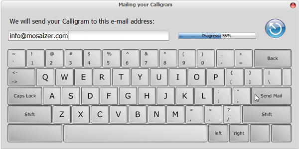
button, will again show this pop-up keyboard. When the
mail client is set up correctly, the visitor will then see the mail-sending
progress bar indicating that the mail and image is successfully sending. During
mail sending the keyboard is de-activated. It's the responsibility of the
visitor to type in the correct e-mail address. In case an error is made, the
blue 'return' button can be pressed. This should be clearly communicated to the visitor, that
in case nothing happens with the progress bar after a few
seconds, the mail can apparently not be sent. Finally, the last step of the
visitor when mailing and/or printing has been completed, is to press the 'Stop' button. In case this is forgotten, the time-out
timer will automatically close the current sessions after the indicated period
of time. After completing the cycle the snapshot image is removed, and
the hot folder is ready for a next snapshot. Using the
webcam for snapshot creation. In a real Photo Booth usually
the visitor is supposed to take the snapshot him/herself. In that case the
option 'Allow to make a snapshot' must be
active. In such Booth the webcam must first be activated. In case the
option 'Allow to make a snapshot' is made active, but the webcam is still not active
the operator, preparing the booth, is informed not to forget to activate
the webcam first. When the booth interface is made active, the 'allow'
options are disabled. You cannot change an 'allow' option when the visitor
interface is active. Closing the interface is first needed, then change the
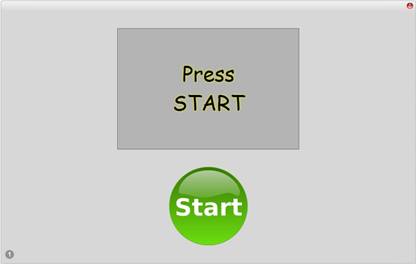
settings, and then activate the booth interface again. The start screen in the
booth for webcam is a gray rectangle with the text 'Press
Start'. With each new visitor the previous data is backed-up and the
images are deleted from the booth interface. This is done to protect the privacy
of the last
visitor.
When the (web)cam is
activated, and the booth interface is active, the start screen is slightly
different: the webcam is active, and a visitor can immediately make a snapshot
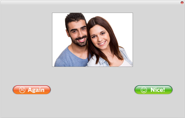
pose, before pressing the 'Start' button. A countdown is shown, counting
down from 5 to 0. When the snapshot is taken, it is now shown. The two buttons
will either continue to the customization screen (described at the start of this
chapter), or re-take the snapshot. Countdown is immediate after pressing
the 'Again'
button.
In case the visitor won't like to continue, a time-out counter will reset the
interface to default (active webcam only, ready to start). The snapshot image is
automatically removed from the Hot folder after completing the cycle, or when
the time-out counter sets the defaults. The Emojigram booth interface
The
Emojigram interface in the booth is slightly different
from the Calligram version. The workflow is however identical, so many
of the above screenshots are also valid for the Emojigram (and as well
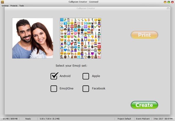
for the Legogram). This is the specific Emojigram interface after a snapshot was taken
or a tethered image has
been made available: On the left the snapshot
is shown, the image on the right shows a random selection of the actual emoji
library. The visitor can now only select the emoji library. Only four
libraries can be shown, and are always shown in alphabetical order. In case
there are 4 in the Homework Studio, the last will not be shown here (e.g.
'Samsung' or 'Twitter'). In case less then 4 libraries were made available in
the Homework Studio, e.g. 3 libraries, then only 3 checkboxes and library names
are shown, etcetera. It's highly recommended to at least offer two. The first
(in alphabetical order) is selected by default. When a different library is
selected in the booth, a new random selection in real size (72 pixels in size)
is shown. The Legogram booth interface
The
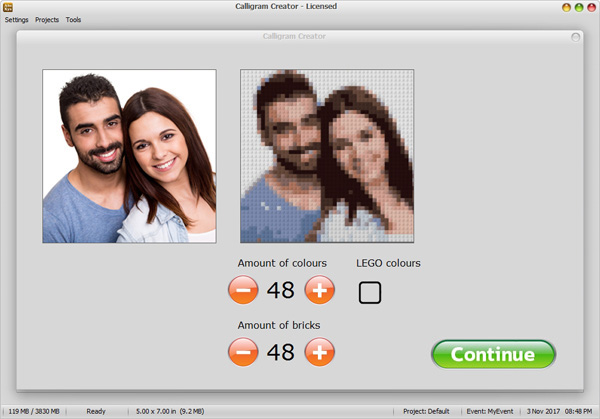
Legogram interface in the booth has three parameters The image on the right is
the initial Legogram with the proposed sizes (here: 48 colours,
48 studs across). The visitor can customize the
Legogram using three parameters: the number of bricks (studs) across, the number
of colours, and if Lego-only colours should be selected. When Lego colours are
selected certain (required) colours may not be available, and the result can
look awkward. But realistic, since this would also look like the result if real
Lego bricks were used. By default, the Lego colours are not selected, since the
result usually looks much better. On the other hand, if the visitor wants to
recreate the image with real Lego bricks then the colours must really be
Lego-only. Note: each time the
visitor selects a different amount, the image on the right will be updated. On
fast systems this may take only fraction of a second, on slow systems the refresh
time may be considered sluggish and annoying. It's a matter of personal
acceptance of how fast the response should ideally be.
The
application has a time-out counter in booth mode. The application simply
measures the period of time of inactive interaction.
Inactive
means: no touch or mouse interaction. This was done to make sure that
unattended booths will automatically return to start, with no previous snapshots or otherwise
customized images still visible. The time-out inactivity period can be set,
as well as the count-down
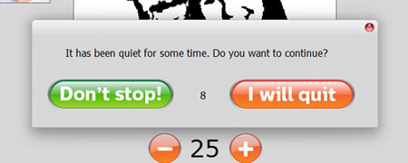
warning pop-up window: When no response is provided
by the visitor, the booth will reset the interface after the count-down reaches
0.

Time-out counter
