 Mosaizer XV / Video -
Help Mosaizer XV / Video -
Help |
 Mosaizer XV / Video -
Help
Transparency
Preamble: please be aware that this function is a highly professional and complex feature. To work
with chroma-keyed pictures requires a deep understanding of how this works, and what effects can be achieved
with transparency. It is therefore highly recommended to study and try-out this function prior to real mosaic
creation. The manual in this chapter provides a good start to work with this function, but the user might still
encounter issues in transparency and dig in the matter deeper than most functions of Mosaizer XV. Typical
issues are: insufficient chroma-key uniformity, green pixels at the edges, less colour matching pictures in the
final combination with tiles. Please keep in mind that APP Helmond cannot provide support for unlicensed
users. What are transparent mosaics? Creating transparent photo mosaics is a
unique and unrivalled possibility of Mosaizer XV. It applies chroma-keying
techniques to make a certain colour (range) transparent. This approach is well known in the film industry and for television shows. Although these industries use hardware chroma-keying, we use
real-time software chroma-keying algorithms. A number of properties can be set to define the chroma-key for transparency.
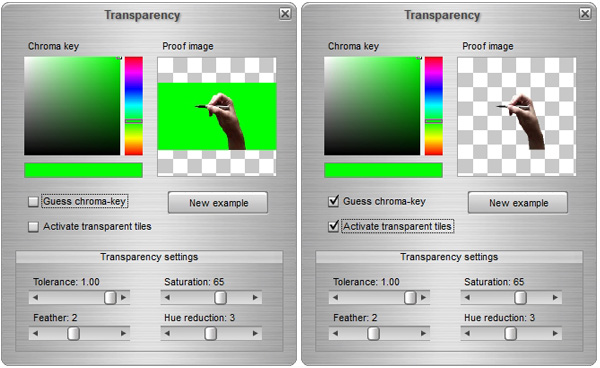
The proof picture on the right shows which colours will be made transparent. The application preselects
a random picture for transparency proof. By clicking on the 'New example'
button you can select a new random picture from
the current library. Transparency settings
The Chroma-key approach in Mosaizer XV follows two different paths: Selected colour approach
To apply the 'Selected
colour' approach you need to check the corresponding checkbox. Also
activate the transparency by checking the box 'Apply
transparency'. To select a transparent colour, simply click on the proof
picture on the right. The selected colour will then appear. In this case only
the 'Hue tolerance' is of importance, the other
parameters do not influence the transparency. When moving the Hue tolerance
slider, you will notice that similar colours as the one you selected will now
also disappear (become transparent). In many cases you should also check with
other proof pictures is the selected colour and tolerance will sufficiently
remove that colour. The more variation in the picture library, the more
difficult it gets to create full transparency all over the
library. It's now the quality of the picture library that
determines the result. HSL approach
The HSL colour space consists of three parameters: hue, saturation and luminance.
The advantage is that the colour tolerance can now very well be
managed, yet the saturation and luminance parameters will also count if
a pixel will become transparent. This approach works very well when one
specific colour is slightly varied, e.g. in luminance within a
picture. In that case the HSL will probably show a
quite good transparency.

Some examples of the use of HSL
Example 1: the skin-coloured box is selected by clicking somewhere on a representative colour. The H, S and L values are copied to the position of the three corresponding sliders (HSL = 26-28-74), and after checking the box 'Apply transparency', the box will almost completely disappear. The feather value of 2 is perhaps too low, and should be a bit higher, to remove the rough edges.

Example 2: the initial hue (green) is removed almost instantly, but still a few traces are left behind. Using the 'Selected colour' will not improve, but decreasing the saturation level, while increasing the lightness level will now effectively remove the green around the boy's head. A slight feather is sufficient in this case. As the lower green chroma key picture shows, all colours that are light green to dark green (almost black, but still have a green hue value) will now effectively be removed. And by lowering the saturation levels, also less saturated greens will now become transparent.

Example 3: To remove the white background will result in a grayscale approach (suggestion). When clicking on white the application will already assume that the picture is in grayscale, and it will check the box 'Apply as grayscale'. In case you uncheck this box, the red colour is shown as the colour. Which is of course not true, but there is no such thing as a white hue... only a very high luminance; and saturation is not relevant in this case (so: 0). By slightly lowering the luminance it will widen the white areas until the entire white background is made transparent. The effect of 'Invert grayscale' is also demonstrated: in that case it assumes that the white is actually black, and all non black parts are now made transparent. Hence the increased transparency of the ice-creams, while the white remains visible. In case the background is black, it's the same approach.

Example 4: In the last example we show a complete rendering of a library of transparent tiles. In this case all the white parts have been removed by first selecting the white colour in the proof picture, then adapt some values, especially the Luminance (=98) and the Feather (=5) values. In addition, we used a random placement, and random grid (Density = 30), and kept the source picture as the background. The result is quite interesting, where the full-size inset shows how accurate the transparency actually works for this library of pictures.
