 Calligram Creator -
Help Calligram Creator -
Help |
Calligram Creator -
Help
Homework Studio
There are four sub-tabs in
the Snapshot Studio, each with a specific function. 1. Calligram text settings
In this
sub-tab all the relevant settings for the text in the Calligram can be
set.
In the screenshot above you see three boxes, each with
a special functional area. These
are: 2. Picture finetune
In this
functional tab you can finetune the Calligram text area. This text area is the
black part of the processed snapshot
picture.
In the screenshot above you see four pictures. From left to right:
the original snapshot, the face outline, the face filled area, and the merged
outline + filled area. There are three possible controls
available. Detection at work. From left
to right: none, skin and face. The skin and face had 20% area expansion, and
were subsequently cropped to fit in the 5"x7" print size. On the left you see a colour
patch, where you can select the chroma key (colour). There are three methods to
determine the chroma key: The
vertical slider on the right
of the rainbow is the sensitivity of colour accuracy. The more sensitive, the
fewer chroma colour is selected to be removed, while less sensitive will select a wide
colour range as the chroma key value. The value of these chroma keys can vary
quite a bit from snapshot to snapshot, especially when the lighting conditions
are changing per snapshot. A final functionality is
perhaps a convenient one: presets of outline-fill combinations. Especially for
certain skin and hair colour (or no hair at all), some settings work very well,
while defaults are not working so very well. The presets are created using
a wide variety of skin and hair colour, with different overall sharpness and
quality of snapshot, so in most cases one of the presets will be just fine. But
it's not guarantee. The two buttons 'Reset to defaults' and 'Save
settings' are shown on all the tabs in the Snapshot Studio, and fix the
current settings in the configuration file. So, next time you open the
application, all these settings are restored again. 'Reset
to defaults' will restore the settings as it was last saved (by
yourself). The last two controls on this tab
are the checkboxes 'Finetune controls in Calligram
Station'. This checkbox toggles between showing the two sliders for outline
and fill on this tab, or on the Calligram Station. In the latter case some
finetuning can be done without switching back and forth to this page during an
event. 3. Emojigram settings
This tab provides
detailed tuning parameters for the Emojigram. There are 4 functional areas: Emoji image
library creation, Emoji image library selection, Emoji mosaic settings, and a visual representation of the library
image colours. In the box 'Emoji library creation', you find basic controls. The
'Select image folder' button will guide you to the folder containing the emoji
images. Since we offer these libraries from our website, the most convenient way
is to download these images, unzip them somewhere on your hard drive, and
direct this folder to that location. These 4 libraries may provide a good start:
Apple, Twitter, Facebook and
Android.
All these downloads are zip files. You should unzip them in a dedicated
folder on your hard drive, and then indicate this location in the application to
make a library ('Select image folder',
see image above).
When
the button 'Create new library' is pressed, the
located folder is read and the images are taken into the newly created library.
Some rules apply: When the library is
successfully created it will be added to the next box: the 'Emoji image library selection'. In this box you find a
single parameter: the selection of the image library. The large image on the
right will reflect the image colours in a YUV-colour scape, where only the U and
V vectors are plotted. For more information, see here (wiki). The mosaic settings box has a
couple of basic controls available. These are: In the example above you can
see the effect of the different settings. the inset shows the actual printing
size. Left top: 30 images across, 50% density. Right top: drawn over source, 48
images across. Bottom left: 48 images across. Bottom right: 74 images across
(so: smaller images). We used the Apple emoji library (2374 images, 72x72x
pixels in size). Finally, the 'Calibrate' button will do a
basic time calibration
for your system, where two emojigrams are automatically created, and the
creation estimation time is then an accurate measure for the expected emojigram creation time. This
estimated creation time is shown in the Calligram Station. When a calibration is
done, the text on the button will show 'Calibration
OK'. You will need to do this only once. 4. Legogram settings
This tab is quite different
from all the other functional tabs. It's not really part of a Calligram creation
cycle: it's creating a picture that takes the snapshot source picture and creates
a brick mosaic out of it, with accurately mimicking a brick pattern, in the
available colours. This means that many of the
previous settings of outline, fill, source colour, text file, fonts, it not
applicable at all. Only a series of colours and brick sizes are important. This
feature is derived from the famous 'Legoaizer' engine
from APP Helmond. It basically tries to recreate the snapshot from bricks
and available colours. In the screenshot above you
find two boxes with specific controls, and a colour listbox. 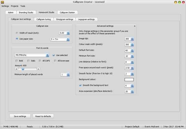
'Calligram size' = the size in inch of the resulting Calligram bitmap (picture).
There are two ways to set the size.
The
first is to indicate only the 'width' (in inches,
here: 5.00 inch), where the height follows by matching the
Calligram size relative to the source snapshot photograph.
The
second approach is to indicate a 'paper size'
(the most current paper sizes are predefined in the drop-down box, here: 5x7
inch). The Calligram output is matched with the paper size width:height
ratio, possibly cropping parts of the source photograph
to allow a for a paper size match. 'Font and words' = the typeface
of the placed words. There are several parameters:
'The
font face'. You can either select a fixed font face from the drop-down
list of available fonts in your system (and check the box 'Use selected') or
use a list of fonts, provided in the Admin tab 'Files and
folders'. In the latter case the fonts are selected from the file containing
the list of fonts, where with each placed word a random font is
selected.
'The
typeface' = bold, italic, lowercase, CAPS. When none of these options
are checked the original typeface is used, where 'the' and 'The' are two
different words.
'Amount' = the maximum amount of words that must be
placed. This amount depends on the available amount of words. In case your
text input file only has 250 different, unique, words, this value will never
be reached.
'Minimum length of placed words' =
the short words can
be filtered out by indicating what length a word must have. Length = amount
of characters in a word. The default is 3, so words like 'the' and 'and'
will be placed, but 'an' and 'or' won't be placed. 'Advanced settings' = several settings that you should
not change, and if you do... know what you are doing:
'Print dpi' = the printer density of the resulting
Calligram (= a bitmap with dpi value). The dpi value not only determines the
actual size on the hard drive (MB), but also the size that is recognized by
your printer. The printer will read the dpi value of your bitmap, and scales
the print accordingly. Although modern printers can easily print 1200 dpi,
that value is very impractical because it's not needed for a good quality
print. A value of 300 is usually good enough, and when you select a paper
size of 5x7 inch the calligram bitmap will become 1500x2100 pixels, which is
quite good as any printer. Bigger is better, but will also take much more
time to create. A second reason to keep this value as small as possible is
to avoid huge bitmaps to be sent as attachment. The 1500x2100 pixel bitmap
is appr. 900 kB in size (jpg compression, quality 9 out of 10).
'Colour mask width (pixels)' = the
size of the outline +
fill mask to determine the Calligram black parts. The bigger this
mask, the more time it requires to create the black and white mask for the
text placement. The default of 300 is quite good, and here bigger is
not always better.
'Default font size' = the maximum font size in the
Calligram. This size is linked to the print size, and the default of 5x7
inch with font 60 create a great looking Calligram. When you want a
Calligram of 8 x 11.5 inch, you also need to increase the font size to match
with the larger output size.
'The
minimum font size' = size of a word that is placed in the
Calligram. The minimum font size is not influenced by paper size, but simply
has a lower limit. We find a 10pt font quite OK, but don't go smaller
than 8pt to avoid a blur of pixelated text all over the Calligram. Bigger
sizes will create interesting effects, and may be explored in tests to set
the right value.
'Line
distance (relative to font)' =
the minimum text is placed with a certain
line distance between the next line of text. This value indicates that
a minimum font size of 10pt and a line distance of 8 creates a quite
well readable text, and is also quite dense.
'Free space around each word
(pixels)'
= a small area around each word is created, where the word in
the Calligram will stand-out better against the background. Like a white
aura.
'Smooth factor' = a certain smoothing can be applied,
where the text is more gradually (smoother) changing from text to
background. The default is 2, and this will create a gentle blur in the
Calligram base images.
'Smooth the background text' = the front text is always
sharp, but the background text can be smoothed as well, to provide a better
contrast with the smaller background words.
'Background colour' = the colour of the Calligram
'canvas'. The default colour is white (or: no text is printed on white
paper), but you may want to change this colour. Be aware that
different colours can create a quite different look of the
Calligram!
'Area expansion (skin/face detection)' = the
minimum area of the face and skin is expanded to allow for a zoom out of the
face and skin (more natural), in percentage of the area
width. 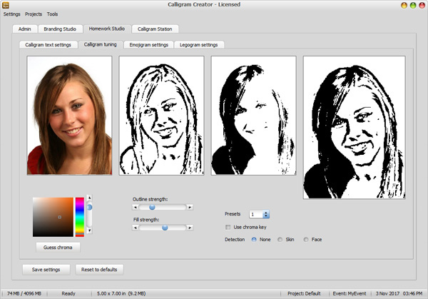
'Outline strength' =
the thickness of the face outline, as processed from the source
snapshot.
'Fill strength' = degree of
black filling in the snapshot.
'Use chroma key' = in case the
background needs to be filtered out, a chroma key can be selected to make this
part white (actually transparent, but in the Calligram it's considered white,
so: no text).
'Detection (None, Skin, Face)'
= when active either the skin or the face is attempted to detect. It's
no guarantee, e.g. when hands or
gadgets obscure the facial characteristics. It's however quite an effective way to imeediately focus
the cropped image in relevant parts (face, arm, shoulder, hands, neck,
or whatever shows skin). Although explained
in the Calligram settings, the detection works for all modes (also emojigrams and legograms).
Below a typical result is shown for none, skin and
face. 
Click anywhere in the
source picture. This colour will be taken as the chroma key.
Select a colour using the colour H-S-V patch. The left
part is the Saturation-Value (=
comparable to colour lightness) area, the vertical 'rainbow'
slider is the Hue value.
Press
the 'Guess chroma'
button. This will attempt to find the chroma key from the colours of the
source picture. 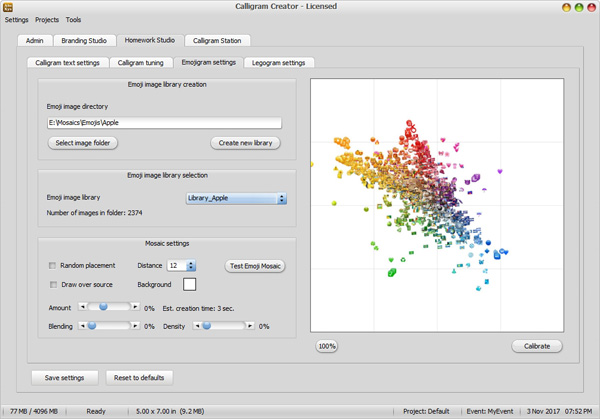
The images must be of type
.PNG, must be transparent and must be of size 72 x 72 pixels. If not... errors
might occur or otherwise strange effect will happen in the
output.
The image library must be
large enough (as in: many images) to be able to serve as a true image library.
The images libraries we offer from our website are 2300 images or
more.
The name of the library
will always be like 'Library_' followed by the name of the folder. Make sure
the folder name is explaining its content clearly.
Random
placement = the placement of the images is done in random order.
If not placed random it will place all the same images in sequence, before
placing a different image. In random order the placement looks more natural,
and certain last placed images won't be shown on top all the
time.
Distance = the target minimum distance between images. It
also indicates the range from which a randomly selected best fit image will
be chosen. The larger the number, the more variety, but also the less fit
because the random selection might result in a less fitting
image.
Draw
over source = when checked the images are drawn over the source image.
The end result apparently looks better but the individual emoji images are
somewhat lost in the total result. best to leave this
unchecked.
Background = in case you don't want white background (and
not drawn over the source) you can select any colour of
mosaic background.
Amount = amount of emoji images over the horizontal. The
more, the better the result looks like, but also the smaller each emoji image
will become (because the size of the end image will not change with increasing
amount, just more but smaller images). A bit of math may be of help: the
default print dpi is 300, so in case of a (w x h) 4 x 6 inch result we
have1200 x 1800 pixels at out disposal. Each emoji is by default 72 pixels, so
1200/72 x 1800/72 = 17 x 25 images will fit on such an image. In case you wish
to have more emoji images, e.g. 50, the actual emoji image size will be
reduced to 1000/50 (width as measure for emoji amount) = 20 pixels in size.
That may be quite small. Either increase print size, or less
emojis.
Blending = a little harmless cheat is possible where the
original image is slightly blended (max 50%) with the Emojigram result. The
blending will greatly enhance the Emojigram result, when modest blending is
done (e.g. 30%).
Density = the amount of emojis is artificially increased
by not only increasing the amount, but also allowing them to overlap. This is
only logical: when more emojis are plotted in the same area, there will be an
overlap of emojis. This effect will greatly improve the overall impression,
and also allow for larger emojis. A good combination is e.g. 30 emojis
and 30% density in our previous calculation example. 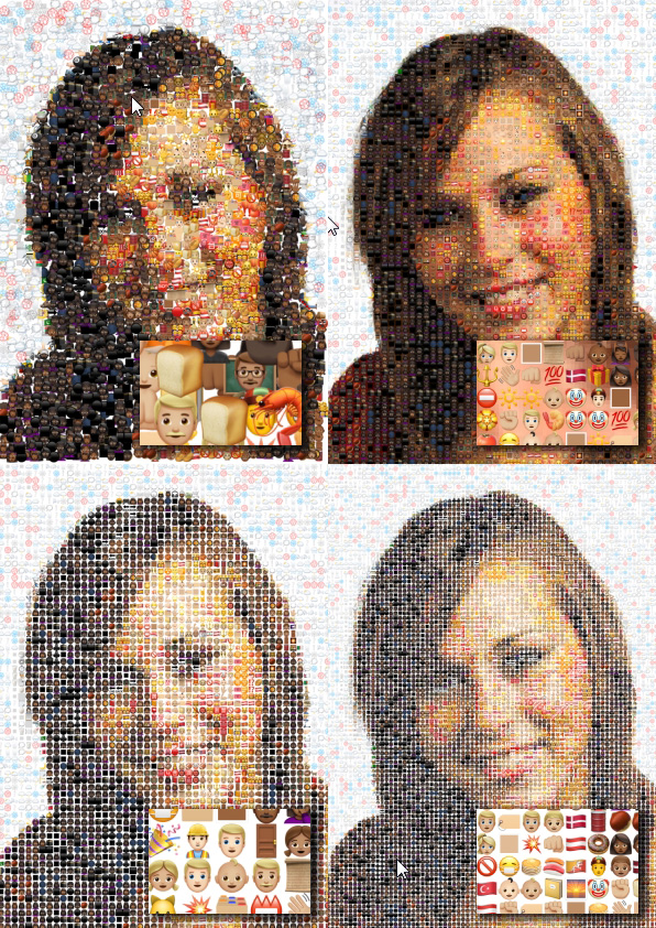
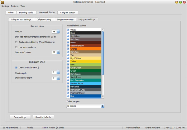
'Size
and colour' = the size of the brick mosaic.
'Amount' = the number of studs on the
horizontal. The number of studs on the vertical is automatically calculated
from the print size (not from the Calligram size, or it will be cropped with
match with the print size). The nu,ber of studs is quote important to
set correctly. Too much and the result doesn't mimic a brick mosaic very
much, too little, and the resemblance with the source snapshot is not very
good. In general about 10 studs per inch is quite OK. It's not a real stud
size, because when printing the real size stud the paper should be
much larger to get a decent resemblance with the original snapshot.
The printed size of the stud is calculated from the amount of
pixels and the number of studs. So when the Calligram ('Legogram'?) is
1500 pixels with 50 studs, each stud is 30 pixels in size, at 300 dpi this
is about 1/10 inch or 2.5 mm. This size is well accepted as a recognizable
brick mosaic and still quite 'bricky' from the bricks of the
mosaic.
'Apply colour dithering' = in some cases it's almost
impossible to create a good looking mosaic because the colours are too
close, and large areas of the same colour show up. In that case the
dithering may be helpful. Dithering also has quite a disadvantage: it
creates a pointillated effect that some people don't
like.
'Use
source colours' = abandon the colour palette from brick (the colourful
stripes in the screenshot above) and simply use artificial colours from the
source picture. These colours are not the commercially available brick colours,
and the Legogram cannot be built with actual Lego bricks (unless someone
wishes to apply spray-paint...). The result is however amazingly
better, since the colour matching is now superb. 'Brick
depth' = an artificial 3D effect by creating some depth (shade) in each
brick.
'Shade depth' = the thickness of the edge to create a
3D effect.
'Shade colour depth' = the deviation of the brick
colour itself (darker at the base, lighter at the top). The more shade depth
the more pronounced the 3D effect will be (up to the point where it
obviously is too artificial). 'Available colours' = the dataset of colours
from real bricks. This set is predefined, and cannot be changed, but
it contains almost every relevant colour which are commercially available,
and are not too expensive. The checkboxes indicate which colours are used in
the Legogram. The 'Colour recipes' box below this overview contains a couple
of funny colour combinations. When selecting a recipe, the checkboxes are
set, indicating which colour are part of that preset. You should only use a
recipe when the event occasion calls for a very special colour combination (e.g.
the Jamaican recipe will consist of only red, green and yellow. Just for
fun).