Brickaizer -
Help Brickaizer -
Help |
Brickaizer -
Help
Tutorial for Image Analysis
Version 5.0 only Brickaizer
has an effective approach to colour tuning. In many cases the selected
colour is just not right for one's taste. That is due to the nature of matching
colours: it's done by a (smart) algorithm, that tries to compare original and
replacement colour, and selects one based on mathematical formulae. In
many cases this is very well done, but in some cases... it's just not
right. For those cases Brickaizer has
a so-called image analysis tool. This tool will analyse the source image for
colours, and range of similar colours. It will then propose the best colour fit
from the available colour palette. So far this is the 'traditional'
approach. But now the user can select any colour from the original
image, and make a different selection of colour. To further support
colour customisation, also some sophisticated pre-processing is possible, where
colours can be tuned and improved. In this
tutorial we will explain the basis of image analysis, show some examples and
hopefully provide a solid starting point for the users to use this new tool. It
is assumed that the user is familiar with all the bells and whistles of the
interface (see here
for more details). Lesson 1: make an
initial analysis The first
step in image analysis is to prepare the basic parameters. The following
parameters have influence on the
image analysis: These (relevant) settings in
the main interface won't affect the image analysis:
Lesson 2: select and
replace colours
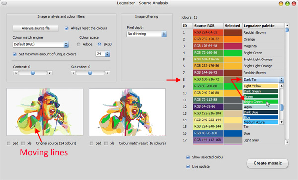
Click on
the name of the colour you wish to replace. In this case 'Dark tan'. You will now see a selection box with all the
available palette colours. From here you can now select your replacement colour.
But first, we like to draw your attention to the selection area in the picture
on the left: some kind of 'moving' lines have become visible (because 'Show selected colour' is active). These are all the pixels
that have colour #8. As you can see, just a few colours have this deviating
colour. Not a big deal? Let's replace this with 'Bright
green'. Select 'Bright green' from the list
and you will notice a slight change in the picture on the right: the colour
change is applied immediately (because 'Live
update'
is active).
This was a very simple lesson. To erase the change, press the 'Anlyse
source file' button once again. The
default selections are
now shown again. To get rid of the moving lines,
simply click anywhere in the image on the left. Lesson 3: select a different colour
match engine
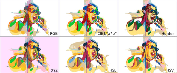
This is
the fun stuff. The result in lesson 2 was based on the same colour match engine
of the 'normal' mosaic creation. We will now select a different colour matching
engine. For instance we will use the 'CIE L*a*b* ' engine. The image on the right is now different,
and the table on the right now shows a different selection of colours. Still
from the same palette, but just showing a different selection. Most importantly:
it depends very much on the kind of image and your personal taste which
colours you prefer. There is no objective truth here. It's your choice, not that
of Brickaizer. It simply proposes the best fit using the selected colour engine
(and colour space). Try a different colour matching engine, and see the
effect of it. We have done this and all results are summarized in the
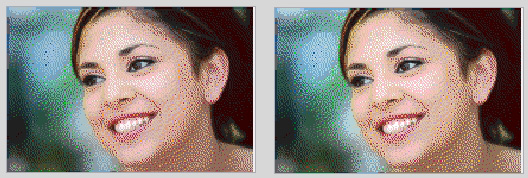
picture below. We have prepared a second example: skin colours. Here
you can see how the different engines respond to skin colours.
Lesson 4: apply a dithering effect prior to
colour matching
Now comes
the real fun stuff: pre-processing the colours of the original image, and then use a colour matching engine. A
short word on dithering (as used here): we disperse pixels in such a way
that with fewer colours we can still create the impression of a rich
palette of colours. It's like cheating: up close you see points of individual
colours, but from a short distance your brain interprets this blend of pixels as a
solid colour. The best approach is to select 'Palette colour' dithering. Here the dithering is done
by only a choice from the current brick colour palette. This way colour
matching and done during the dithering stage, and the colour matching engine is
basically circumvented. The result is absolutely stunning (by the way, this is
the same dithering as the 'normal' approach in older versions of Brickaizer,
prior to version 5.0). This approach works best with 1x1 bricks only (or
beads). A second approach is to select the dithering
combination of 'Original colour' with 'Median cut' and 'Error
diffusion'. The result is less
realistic, but more suitable for multiple bricks sizes. In the example below the HSL colour engine seems to create the best
colour match. The other dithering options are best suited for a
different kind of mosaic: using almost a mono colour approach.
We demonstrate this with a colour picture, but we want to use a
bluish colour scheme to create an arty mosaic. Here we show 5 examples of the effective use of colour dithering, with a colour
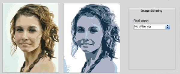
source image. Example 1: no dithering. Nice fill of bluish colours,
and great for 'posterizing' effect, but this not what we had
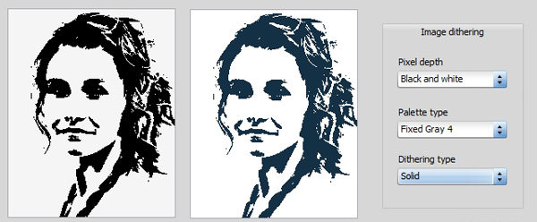
in mind. Example 2: black and white dithering. Only two 'colours' are required. It selects the best fit with
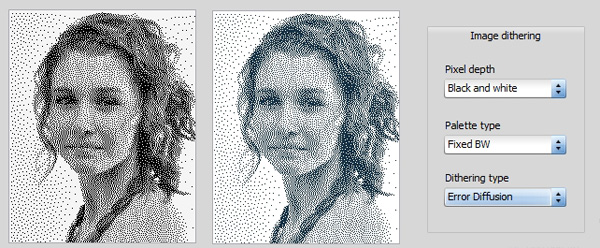
the black. Example 3: error diffusion method in black white. Same
as example 2, but not more pixelated, and more depth of the
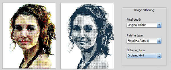
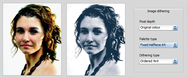
mosaic result. Example 4: fixed halftone and ordered. The colours are
quite well translated in 8 shades of gray (into blue, we had only 14 shades of
blue in our palette). We added some contrast to the original: a value
of 8. Example 5: same as example 4 (adding contrast), but now we
used fixed halftone, where 64 shades of gray are created, and a 4x4 dithered pattern. Sharp, sufficient colour depth and a very good impression of
the original. Lesson 5: making a mosaic with after
image analysis
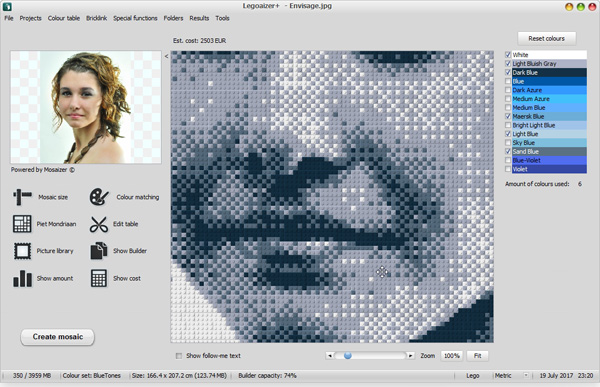
When you
are finally satisfied with your colours, press the button 'Create mosaic'
in the analysis windows (not the usual button!). It will circumvent the traditional way
of creating a mosaic, and use the current right image and the selected
colours instead. The output is as usual: a (brick) mosaic image
and a blueprint excel spreadsheet. Ready for building. The close-up image below shows the results from
example 5. What can you
do now?
Just keep playing with settings of dithering, colour matching
engines, and colour spaces. For almost every kind of image there will be
an ideal combination of setting. It's your 'quest' to find it.
It's hard to provide more guidelines. Hopefully, the examples above are motivating to simply
do it.
Size (amount of studs,
vertical and horizontal)
Colour set (i.e. the
colours in the table on the right in the main interface)
Colour filter (main menu > 'Special functions' > 'Colour
filters' > 'Filters')
Cropping
area
Colour
matching (dithering, max number of colours, iterate, etc).
Colour weight (main menu > 'Special functions' > 'Colour
filters' > 'Colour
weights').
Bricks selection, the
colour analysis runs independent from the choice of bricks (which is not
entirely true...) Finally, the image analysis
doesn't work either for the Mosaizer XV engine with actual pictures. That
approach is completely different from the analysis approach.
The
first step is to prepare the basic parameters: set the size, the colour table
and the pre-filters. Then open the analysis window from the menu bar > 'Special functions' > 'Source
analysis'. The interface is almost empty, so simply press the 'Analyse source file'
button, and wait. The time of waiting will depend on the size of the
mosaic. Usually this is done within a second. The picture below shows the
result.
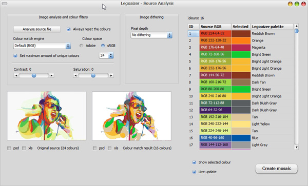 Now the
difference between selected and original source colours is quite visible. For
instance colour #8 (RGB 160-216-72) is quite
different from the selected one: Dark tan. We will now
show you how to select a different, hopefully better matching
colour.
Now the
difference between selected and original source colours is quite visible. For
instance colour #8 (RGB 160-216-72) is quite
different from the selected one: Dark tan. We will now
show you how to select a different, hopefully better matching
colour.